Start Your Book Printing Project
Share a few details about your book. JetPrint will review your specifications and help you identify the suitable printing, paper, binding, and finishing options for your project.


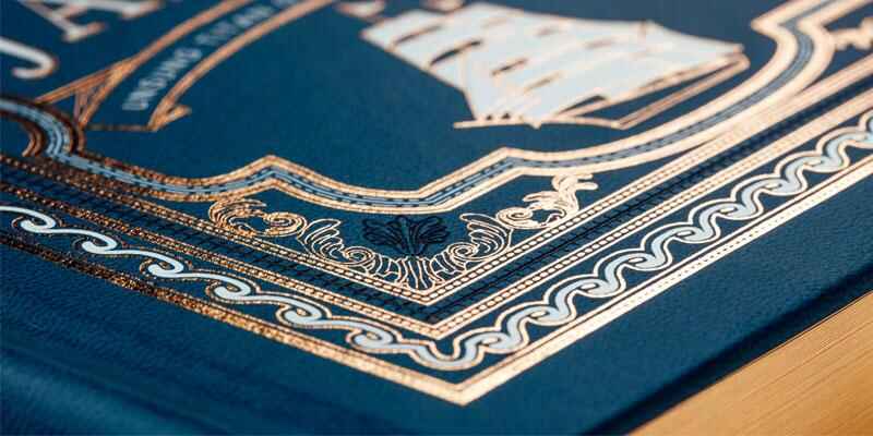
Finishing changes everything.
Because a cover printed from the same CMYK file can feel mass-market, archival, cosmetic, or collectible depending on what happens after the press sheet dries, buyers who treat print finishing as a decorative afterthought usually discover the real cost only after sampling, tooling, and reruns.
So why do so many specifications reduce it to a single line?
I take a hard position on this: foil stamping, embossing, and spot UV should be treated as manufacturing processes, not visual filters. Each one changes how a cover reflects light, responds to touch, tolerates handling, and moves through production.
The evidence for tactile finishing is not merely anecdotal. A Rochester Institute of Technology study involving 400 participants evaluated preferences for soft-touch and raised tactile coatings. Its findings support what experienced print buyers already suspect: surface treatment can influence how people evaluate packaging before they have read much of the printed message.
But tactile appeal does not excuse bad engineering.
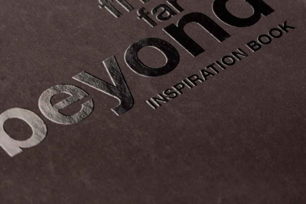
Print finishing covers processes applied after the main image has been printed. Depending on the project, that may include lamination, foil transfer, embossing, debossing, die-cutting, varnishing, edge treatments, or combinations of several operations.
For book projects, finishing is commonly applied to:
When reviewing a custom book printing specification, I would never approve “gold foil on cover” as a complete instruction. It fails to identify the foil grade, stamping position, substrate, laminated surface, die type, image dimensions, tolerance, or whether the foil must align with printed artwork.
That missing information matters.
A reflective gold title on smooth black paper, for example, behaves differently from the same title placed over matte polypropylene lamination. A fine serif may stamp cleanly on one material but fill in, break, or show pinholes on another.
The best print finishing techniques are therefore not simply the most expensive ones. They are the techniques that remain stable on the selected material, survive normal handling, and reinforce the design hierarchy without creating an unnecessary production problem.
These three finishes are often grouped together because they create premium visual effects. Mechanically, however, they do very different things.
Foil stamping uses a heated die, controlled pressure, and a carrier-backed transfer foil. The die contacts the foil and substrate, releasing the selected decorative layer onto the printed surface.
The transferred material may appear:
Industrial equipment reveals how physical the process really is. Heidelberg lists hot-foil presses with up to 300 tons of foiling pressure and production speeds reaching 7,500 sheets per hour. Those figures do not mean every job requires maximum pressure; they demonstrate that foil stamping is controlled converting, not an inkjet imitation of metallic colour.
Foil reflects light because a transferred layer sits on the surface. CMYK gold does not. Metallic ink may contain reflective particles, but it normally cannot reproduce the mirror-like contrast of hot foil.
This makes foil effective for:
But more foil is not automatically better. Large solid areas may expose pinholes, uneven transfer, dust contamination, or slight changes in pressure across the sheet. Fine reverses can close. Tiny counters inside letters such as “A,” “B,” “R,” and “e” can fill in.
My blunt view? Foil looks expensive when it is restrained. When every border, icon, subtitle, and decorative line is metallic, the cover often looks like the designer discovered the effect yesterday.
Embossing creates a raised image by pressing the substrate between male and female dies. Debossing pushes the image inward instead.
What buyers sometimes call “embossing printing” is not actually an ink-printing process. It physically deforms paper, board, cloth, laminated cover material, or another suitable substrate.
Embossing may be produced as:
Blind embossing can be particularly effective on uncoated paper, cloth cases, or restrained hardcover designs. It does not shout. That is precisely why it works.
A shallow raised logo may feel more deliberate than a large metallic panel because the reader discovers it through changing light and touch. Yet deep embossing is not suitable for every cover. Excessive pressure may crack printed ink, mark the reverse side, distort thin board, or produce visible show-through.
Paper grain, fibre length, moisture, caliper, coating, lamination, and image geometry all affect the result. Rounded shapes generally tolerate forming better than isolated sharp points.
Spot UV printing—more accurately described as spot UV coating—applies a clear, UV-curable varnish to selected areas rather than coating the entire sheet.
The varnish is cured rapidly with ultraviolet energy. It can produce:
Traditional spot UV may be screen-applied, while digital embellishment systems can jet polymer onto specific areas without conventional screens or dies. Scodix, for example, describes technologies including SHD imaging, RSP sheet registration, PAS polymer management, and multi-layer applications for spot gloss, tactile varnish, and digital foil.
Spot UV is especially effective over matte lamination because the gloss difference becomes obvious. Put the same clear coating over an already glossy cover and much of the visual contrast disappears.
This is a common purchasing mistake. The buyer pays for spot UV, but the base surface does not give the coating enough contrast to justify the added process.
| Finish | Physical mechanism | Strongest visual effect | Best applications | Main cost drivers | Frequent production failure |
|---|---|---|---|---|---|
| Foil stamping | Heat and pressure transfer a decorative layer from a carrier film | Metallic reflection, colour shift, holographic detail | Titles, logos, borders, limited-edition details | Die, foil area, foil grade, makeready, sheet quantity | Pinholes, incomplete transfer, filled counters, flaking |
| Embossing | Matched dies physically raise or recess the substrate | Tactile depth and changing shadows | Logos, patterns, blind cover details, premium cases | Male and female dies, depth, board thickness, registration | Cracking, show-through, crushed detail, distorted board |
| Spot UV | Clear varnish is selectively applied and UV-cured | Gloss contrast and optional raised texture | Images, patterns, typography, matte-laminated covers | Screen or digital setup, coverage, coating height, registration | Misalignment, orange peel, weak contrast, blocking |
| Foil embossing | Foil transfer and relief are combined | Reflective colour plus three-dimensional form | Premium titles, emblems, crests, monograms | Combination die, tighter setup, pressure control | Double image, foil fracture, poor register |
| Digital embellishment | Polymer and foil effects are digitally placed | Variable, short-run, raised or personalised effects | Prototypes, short editions, variable covers | Machine click, coating volume, substrate compatibility | Banding, poor adhesion, inconsistent height |
The table exposes an uncomfortable truth: specialty printing finishes are not interchangeable upgrades.
Foil creates reflection. Embossing creates physical relief. Spot UV creates gloss and coating height. Selecting one merely because it appears “premium” in a sample book ignores what the cover actually needs to communicate.
The quoted finishing price is only part of the cost.
A poorly planned finish can also require revised artwork, new dies, additional samples, longer drying or curing schedules, manual inspection, slower running speeds, extra spoilage allowance, and replacement covers when adhesion fails.
Conventional foil stamping and embossing normally involve physical tooling. A larger image generally requires a larger die. Multi-level embossing requires more complex tooling than a basic single-level image.
That setup cost is spread across the order quantity.
For a long offset run, tooling may be economical because the setup cost is divided across thousands of copies. For a prototype or a short collector’s edition, digital foil or digitally raised varnish may avoid conventional dies, although the per-sheet cost can remain higher.
This is why a printer should know the expected quantity before recommending a process. The appropriate method for 100 covers may not be the appropriate method for 10,000.
A capable book printing factory with in-house or coordinated finishing operations should evaluate the full sequence rather than quoting every process in isolation.

Design software allows two objects to align with mathematical perfection. Physical sheets move.
Paper expands and contracts. Printed sheets may shift during lamination. Grippers, guides, screens, dies, cameras, and operators all introduce tolerances. Even a sophisticated machine still processes a physical substrate that has already passed through earlier operations.
For that reason, factories may recommend starting allowances such as:
These are practical starting points, not universal standards. The actual limit depends on equipment, die material, cover stock, artwork scale, lamination, and production sequence.
Designers dislike hearing that. Pressrooms dislike pretending otherwise.
A finish cannot rescue an unsuitable material.
Smooth coated sheets generally support finer foil detail and cleaner spot UV edges. Uncoated papers may produce a softer, more tactile result but can absorb coatings or reveal fibre variation. Cloth, synthetic cover materials, leather-like surfaces, and heavily textured stocks may require specialised foil grades or lower-detail artwork.
Before selecting a surface, review the available printing and finishing capabilities and ask for a material-specific test.
Not a generic sample.
A gold foil sample on smooth coated paper does not prove that the same foil will adhere to your textured blue book cloth. A deep embossing sample on 2.5 mm case board does not establish what will happen on a 300 gsm paperback cover.
Hardcover cases tolerate a broad range of finishes because the printed cover wrap is mounted to rigid board. Foil titles, blind embossing, foil embossing, debossed emblems, and spot UV details may all be considered.
However, hinge areas need special attention. A finish placed too close to a joint can crack, distort, or disappear into the groove when the case is formed.
For clothbound or paper-over-board books, a restrained foil title or blind deboss often works better than a full-cover effect. The rigid structure already gives the object physical presence.
Paperback covers bend repeatedly. That changes the risk profile.
Heavy raised coatings near the spine may crack or become uncomfortable during opening. Deep embossing may weaken the cover or show on the reverse. Foil positioned across a fold may fracture after repeated use.
Spot UV over matte lamination can work well on paperback covers, provided the coating remains away from heavily flexed areas and the lamination has suitable adhesion.
The hard truth is simple: the finish must survive the reader, not just the approval photograph.
Illustrated books often benefit from selective contrast rather than aggressive decoration.
Spot UV can isolate a face, object, brushstroke, vehicle, architectural detail, or title. A small foil element may establish a premium cue without competing with the artwork.
But putting spot UV over every photograph usually weakens the concept. When everything is highlighted, nothing is highlighted.
Durability and safety expectations matter more than visual novelty. Finishes should be evaluated for rub resistance, edge behaviour, coating adhesion, and intended age group.
Raised effects can be engaging, but tiny detached elements, fragile foil areas, sharp relief, or coatings that crack under bending are poor choices for heavily handled products.
Board books also require attention to trimming, rounded corners, lamination, and page construction. Decorative finishing must be considered together with the product structure, not added after the mechanical design has been approved.
Limited editions are where combined finishing can make commercial sense.
A numbered foil title, blind embossed symbol, contrasting spot UV pattern, coloured edge, ribbon, and slipcase may create a coherent collectible object. But the processes need a hierarchy.
I would rather see one excellent foil emboss than five unrelated premium effects competing for attention.
Every finish should be supplied as a separate production mask.
For conventional prepress, the safest workflow is usually to create dedicated vector spot colours named clearly, such as:
FOIL_GOLDFOIL_SILVEREMBOSSDEBOSSSPOT_UVDIE_CUTUse 100% solid fills. Avoid gradients unless the selected digital process explicitly supports variable coating height. Do not rely on transparency, blending modes, hairlines, overprint previews, or raster effects that may separate unpredictably.
The file should also include a visual reference showing what the finished cover is supposed to look like. A production mask tells the operator where the effect goes. It does not always explain the designer’s intention.
For dependable output:
And remember: an on-screen PDF cannot prove foil reflectivity, emboss depth, varnish height, paper texture, or adhesion.
It can only prove position.
This part makes marketing teams uncomfortable.
A paper-based cover should not automatically be described as recyclable, environmentally friendly, plastic-free, or sustainable merely because its main substrate is paper. Lamination, coatings, adhesives, metallised layers, binding materials, and local recycling infrastructure all affect the full claim.
The U.S. Environmental Protection Agency lists UV-cured coatings among examples of low- or no-VOC/HAP coating technologies. Yet older EPA technical guidance also warns that UV/EB materials are not automatically emission-free; cure volatiles can still occur depending on the formulation and application. “UV” should therefore not be used as a synonym for “zero environmental impact.”
Foil stamping also needs careful terminology. Transfer foil is not the same construction as permanently laminating a sheet of aluminium foil to paper. KURZ states that some of its transferred decorative layers are approximately 1.5–3 μm thick and may account for about 1% of total product mass, but that manufacturer-specific information does not replace testing of the complete finished item.
A July 2026 Reuters report on paper-based packaging reported an 87% paper recycling rate across Europe while also noting that coatings can threaten recycling performance. It also cited research indicating that 72% of UK consumers preferred carton board or cardboard packaging over plastic. Consumer preference is moving faster than many recovery systems.
Legal wording matters too. The FTC Green Guides state that an unqualified recyclable claim generally requires suitable recycling access for at least 60% of consumers or communities where the item is sold. The guidance also gives examples of deceptive claims involving bonded multi-layer materials that most recycling systems cannot separate.
So we should be precise:
“Looks sustainable” is not a specification.
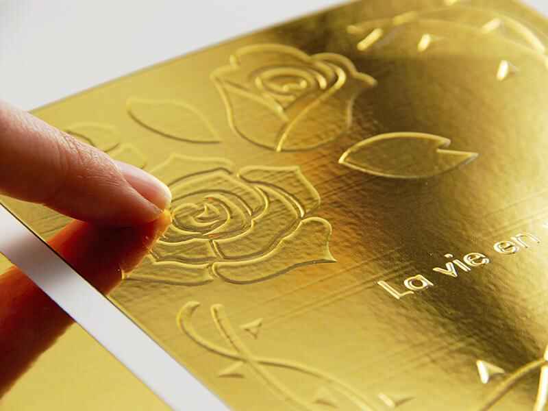
Use foil stamping when the design requires reflection, metallic colour, holographic movement, or a strong focal point.
Use embossing when the design requires physical relief, understated tactility, or a mark that changes as the reader handles the cover.
Use spot UV when the design requires clear gloss contrast, selective image emphasis, a transparent pattern, or a raised coating without metallic colour.
Combine them only when each process has a separate job.
A strong combination might be a gold-foiled title, a shallow blind deboss around the publisher mark, and a subtle spot UV pattern visible only under angled light.
A weak combination is foil on the title, foil on every ornament, embossing behind the foil, spot UV over the illustration, soft-touch lamination underneath everything, and no visual hierarchy at all.
Premium does not mean crowded.
Print finishing is the set of post-print processes applied after ink has reached the sheet, including foil transfer, embossing, varnishing, lamination, die-cutting, and binding-related decoration, with the purpose of changing appearance, texture, durability, or perceived value rather than adding ordinary CMYK image content.
The appropriate process depends on the substrate, artwork, quantity, binding style, handling requirements, and target cost. Finishing should be planned before artwork approval because folds, joints, trim lines, coatings, and production tolerances can affect the design.
Foil stamping applies a thin metallic or pigmented transfer layer with heat and pressure, embossing reshapes the paper into a raised or recessed relief with matched dies, and spot UV places a glossy UV-cured coating only on selected artwork areas to create contrast against the surrounding surface.
Foil primarily changes reflection and colour. Embossing changes physical shape. Spot UV changes gloss and, in high-build applications, coating height. They may be combined, but each requires its own artwork and production controls.
The best finish for a book cover is the one that supports the design hierarchy, substrate, run length, handling conditions, and budget: foil suits reflective focal points, embossing suits tactile depth, and spot UV suits gloss contrast over a matte or uncoated-looking background.
Hardcovers can support more substantial embossing than flexible paperback covers. Paperbacks need finishes that tolerate repeated bending, while illustrated books often benefit from selective treatment that does not compete with the printed image.
Foil stamping, embossing, and spot UV can be combined on one cover, but the artwork must separate each finish into its own vector mask, allow realistic registration tolerance, avoid crowded overlaps, and follow a production sequence confirmed by the printer before dies, screens, or digital embellishment files are made.
Foil embossing is a familiar combination because colour and relief occupy the same area. Spot UV may then be added elsewhere, but combining several processes increases setup, inspection requirements, waste allowance, and the possibility of misregistration.
Coated cover stocks usually provide the sharpest spot UV and fine foil detail, while dense uncoated stocks can produce a refined embossed or debossed effect; however, fibre texture, absorbency, surface treatment, lamination, cracking risk, and foil adhesion must all be tested on the actual material.
There is no universal “best” paper. Smooth paper supports fine detail, while textured material may require heavier lines and larger gaps. A material-specific physical sample provides better evidence than a supplier’s unrelated sample book.
Print-finishing artwork should be supplied as a press-ready PDF with separate, clearly named vector spot-colour layers for FOIL, EMBOSS, DEBOSS, or SPOT_UV, using 100% solid fills, no transparency, no hairlines, and no accidental rasterization, together with a visual reference showing the intended effect.
Ask the printer for minimum line widths, negative gaps, fold clearances, overprint settings, and registration tolerances. These limits vary by substrate, image area, die technology, coating system, and finishing equipment.
Specialty finishes are not automatically recyclable or non-recyclable; recyclability depends on the complete construction, including paper fibre, lamination, adhesive, transferred foil, UV coating, local collection systems, and mill-screening capability, so environmental claims should be qualified and supported rather than inferred from a paper-based appearance alone.
Transfer foil may use far less material than foil-laminated stock, but that distinction should not be converted into an unsupported blanket claim. Obtain written data for the exact materials and evaluate the markets where the finished books will be sold.
Do not send a printer a cover mockup and ask for “something premium.”
Identify the substrate, binding structure, finish locations, foil colour, emboss direction, coating height, quantity, artwork tolerances, and sampling requirement. Then ask the production team to challenge the specification before tooling begins.
JetPrint can review your cover artwork alongside the book format, paper, lamination, binding, and finishing sequence. Submit the files and intended effects through the JetPrint contact page to request a manufacturing review before approving your final print finishing plan.

Leave Your Comments