Start Your Book Printing Project
Share a few details about your book. JetPrint will review your specifications and help you identify the suitable printing, paper, binding, and finishing options for your project.

Files fail silently.
A PDF can appear flawless on a laptop yet contain undersized pages, missing bleed, substituted fonts, low-resolution images, hidden RGB objects, incorrect overprints, or transparency behavior that only becomes visible after the file enters a commercial RIP workflow.
Why discover that after printing 5,000 copies?
That is the hard truth about print production: a PDF is not print-ready merely because it opens without an error message. It is print-ready only when its geometry, colors, fonts, images, page boxes, and output instructions match the production method that will actually be used.
I treat every final PDF as a manufacturing file, not a visual preview. The distinction matters whether you are producing a paperback novel, an illustrated catalog, a training manual, or a casebound children’s book through a custom book printing service.
A print-ready PDF is a self-contained production document that includes the final page dimensions, sufficient image data, usable fonts, defined color information, correct bleed, and no security restrictions that would prevent prepress software from inspecting or processing the file.
It should answer six questions without forcing the printer to guess:
Adobe’s current InDesign documentation divides PDF export controls into standards, compatibility, compression, marks and bleeds, output, advanced settings, security, and summary checks. That organization is revealing: “Save as PDF” is not one decision. It is a chain of production decisions. Adobe’s PDF export options specifically identify bleed, color conversion, output intent, compression, and font embedding as separate controls.
A good PDF preserves the designer’s intent. A great one also communicates that intent to the press workflow.
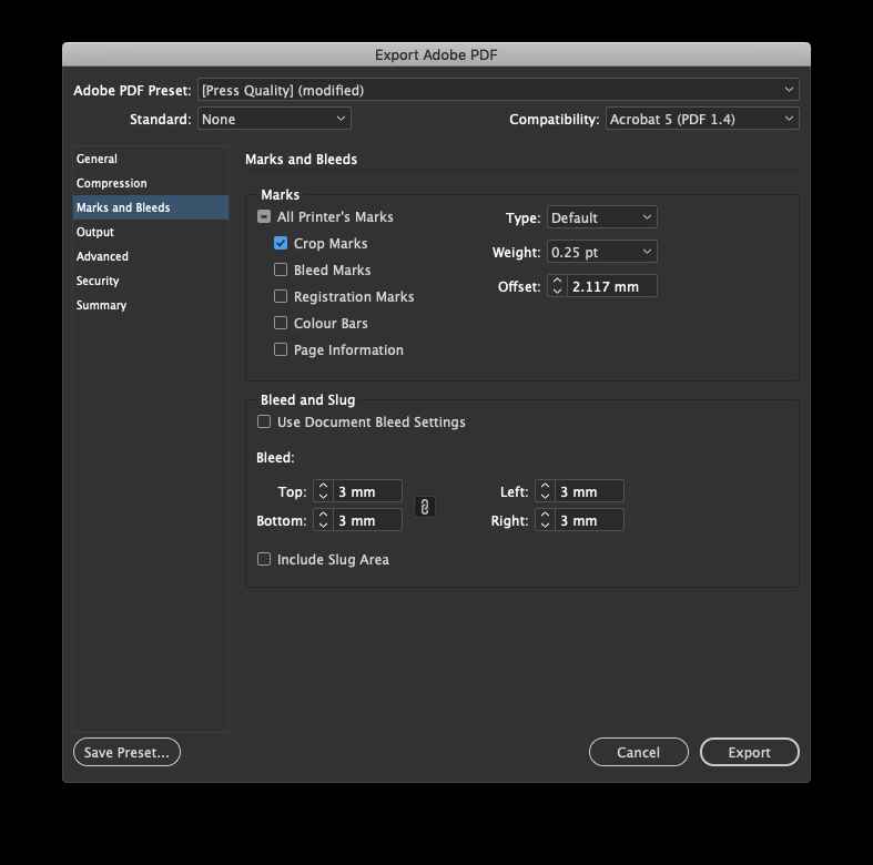
Export settings cannot repair a badly constructed document. They can package it, compress it, convert it, and flag some errors, but they cannot invent missing image detail or restore artwork that was never extended into the bleed.
Create the document at the finished page size, not at the size of the sheet that will run through the press.
For example, a 210 × 297 mm A4 manual should have a 210 × 297 mm trim box. The printer handles imposition, sheet layout, gripper allowance, folding schemes, and press marks later. Sending printer spreads or oversized pages often creates more work rather than less.
For bound books, interior pages should normally be exported as individual pages in reading order. The cover is usually prepared as a separate one-page spread containing the back cover, spine, and front cover according to a printer-supplied template.
Blurb’s current PDF-to-book specifications, updated July 21, 2026, illustrate this production model: interior pages are submitted as individual pages rather than reader spreads, while the cover is generally exported separately. Its system flags incorrect page dimensions during preflight. Blurb’s PDF-to-book checklist also warns designers not to calculate cover dimensions without the format-specific specification.
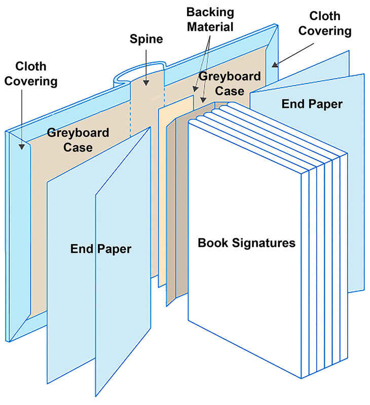
This is especially important for hardcover books. Spine width changes with page count, paper thickness, binding construction, and board configuration. A cover template created before those variables are confirmed is not a final cover template.
Bleed is artwork that extends beyond the final trim line so normal cutting variation does not leave an unwanted white edge.
A widely used benchmark is 3 mm or 0.125 inch on every outside edge. But that is a benchmark, not an international commandment. Your printer’s specification controls.
The U.S. Department of Energy’s Headquarters Print Services requires a 1/8-inch bleed where applicable, along with final-size pages and trim marks. Utah Valley University Printing Services also specifies 0.125-inch bleed for edge-to-edge artwork. These independent production requirements show why 3 mm or 1/8 inch remains common in commercial file preparation.
Do not merely enlarge the page after the design is finished. Backgrounds, photographs, textures, and full-page colors must physically continue into the bleed area.
And keep important content away from the trim. Page numbers, logos, QR codes, borders, captions, and small text need an internal safe margin specified for the binding and trimming method. A thick perfect-bound book may require more allowance near the spine than a saddle-stitched booklet.
“High resolution” means nothing without final dimensions.
An image may be 300 PPI when placed at 100%, but only 150 PPI after being enlarged to 200%. The value that matters is effective resolution at the size used in the layout.
For most continuous-tone photographs, aim for approximately 300 PPI at final print size unless the printer provides a different target. The DOE requires images of at least 300 dpi for its publication files, while UVU advises images close to 300 PPI at final size.
Do not resample a 900 × 600-pixel web image to 300 PPI and assume you created detail. You only changed the metadata or invented pixels. The original image still contains the same visual information.
Vector logos, typography, and line drawings should remain vector whenever practical. But highly complex vector objects can overload some workflows, so special illustrations, maps, CAD exports, or transparency-heavy graphics deserve individual testing.
A print-ready PDF should contain every font needed to reproduce the document.
Font embedding prevents a different workstation or RIP from replacing an unavailable typeface. Subsetting is normally acceptable because it stores only the characters used in the document, reducing file size while preserving appearance.
The U.S. Copyright Office requires fonts in submitted newsletter PDFs to appear as “Embedded” or “Embedded Subset” in Acrobat’s Document Properties. It also requires the files to remain viewable, searchable, and free from passwords or digital-rights restrictions. The Copyright Office’s digital-file rules are not a commercial printer’s specification, but they demonstrate how a large institutional workflow protects rendering consistency.
In Acrobat, open:
File → Properties → Fonts
Every listed typeface should show Embedded or Embedded Subset.
No exceptions hidden in the small print.
Many guides say, “Convert everything to CMYK.” I think that advice is too blunt.
Some printers require a fully converted CMYK PDF. The DOE, for example, directs publication creators to convert all colors to CMYK because RGB elements may not convert as expected in its workflow. That is a valid production rule for that specific print environment.
But random CMYK conversion is not color management.
A CMYK value has meaning only in relation to a printing condition, ink set, substrate, tone-value behavior, and ICC profile. The same values can produce visibly different results on coated paper, uncoated stock, digital toner equipment, or an inkjet proofing system.
So I use a harder rule:
Never convert color until you know the destination.
Before creating a CMYK PDF for printing, ask the printer which output condition or ICC profile should be used. Depending on the job, that may be a regional offset-printing profile, a device-specific digital profile, or a workflow that accepts tagged RGB and performs conversion later.
Adobe provides three relevant export approaches:
Adobe also states that the output-intent profile describes the intended printing condition and is required for PDF/X compliance.
That output intent matters. Without it, “CMYK” is an incomplete instruction.
Small black text should generally use a single black separation, commonly expressed as:
C0 M0 Y0 K100
Using four-color rich black for small body text creates a registration problem. If cyan, magenta, yellow, and black do not align perfectly, the letters may appear soft or fringed.
Large black backgrounds are different. They may need a printer-approved rich-black build to avoid looking weak or uneven. Do not invent the formula. Ask the printer because total ink limits and preferred mixtures depend on the process and paper.
Pantone and other spot colors should remain spot colors only when the production quote and press plan include separate spot-color units.
Otherwise, convert them using an agreed process-color method and verify the result with a proof. A spot color left accidentally inside a file can trigger an unexpected plate, an automated conversion, or a prepress query.
Use Acrobat’s Output Preview to inspect the actual separations. Turn individual plates on and off. Check whether a logo intended as one spot ink has silently become CMYK.
PDF/X is a family of ISO standards designed for reliable graphic-arts exchange. It restricts or controls PDF features that can cause uncertainty in print production.
For modern workflows, PDF/X-4 is generally the better starting point because it supports live transparency, layers, ICC-managed color, and an output intent without forcing premature transparency flattening.
The Ghent Workgroup states that its older GWG 1v4 specification, based on PDF/X-1a, is more than 20 years old and is no longer supported by the organization. GWG now advises using its PDF/X-4-based GWG 2015 or GWG 2022 specifications.
Old does not automatically mean bad. Some printers still request PDF/X-1a because their RIP, automation, newspaper workflow, or production policy is built around flattened CMYK files.
But do not select PDF/X-1a merely because an online tutorial written in 2012 called it “press quality.”
Ask first.
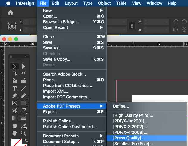
Adobe’s 2026 InDesign guidance confirms that print PDFs can be exported through either a PDF/X preset or a selected PDF/X standard. Its compatibility documentation also shows that PDF 1.4 and later support live transparency, whereas PDF 1.3 requires transparency flattening.
For a printer that accepts PDF/X-4, a practical export setup often looks like this:
These settings are a starting point, not a substitute for the printer’s file specification. The available equipment, paper options, binding processes, and finishing methods described under commercial printing capabilities can affect how a file should be built.
A proper preflight is an inspection, not a quick visual scroll.
Adobe Acrobat Pro includes predefined profiles for digital printing, prepress, PDF analysis, and PDF/X compliance. Those profiles can report mismatches, apply selected fixes, and be customized with checks for properties such as image resolution.
Use this checklist before uploading the final file:
| Preflight item | Recommended condition | Common failure | How to verify |
|---|---|---|---|
| Trim size | Matches the confirmed finished size | A4 artwork submitted for a different custom trim | Check Acrobat page boxes and document dimensions |
| Bleed | Printer-specified bleed on every required edge | Background stops at the trim line | Display TrimBox and BleedBox |
| Page structure | Interiors as individual pages; cover prepared separately when requested | Reader spreads or mixed cover/interior dimensions | Review page thumbnails and file dimensions |
| Image resolution | Approximately 300 PPI at final size | Web images enlarged inside the layout | Run an Acrobat image-resolution preflight |
| Fonts | Embedded or embedded subsets | Font substitution or missing characters | File → Properties → Fonts |
| Color spaces | Match the agreed production workflow | Hidden RGB, Lab, or unwanted spot colors | Use Output Preview and preflight |
| Output intent | Correct ICC profile for the intended print condition | Generic or incorrect destination profile | Inspect PDF/X output intent |
| Black text | Printer-approved single-black build | Four-color small text | Check separations in Output Preview |
| Spot colors | Only intentional and quoted spot inks remain | Duplicate spot names or accidental Pantone colors | Inspect the separation list |
| Overprint | Applied only where intended | White objects set to overprint and disappear | Enable Overprint Preview |
| Transparency | Preserved for PDF/X-4 unless instructed otherwise | Flattening seams or altered effects | Inspect compatibility and transparency |
| Crop marks | Added only when the printer requests them | Marks included inside the bleed or live area | Confirm the supplier’s specification |
| Security | No password or processing restrictions | RIP or preflight cannot access the content | Check Document Properties → Security |
| Page count | Matches binding and production requirements | Missing blanks or incorrect pagination | Compare PDF thumbnails with the approved pagination |
| Final content | No comments, hidden objects, guides, or outdated layers | Notes or alternate artwork prints unexpectedly | Review layers and perform a final visual proof |
Here is an opinion that irritates some designers: crop marks are not proof that a file is professional.
Some production departments request them. Others add their own marks during imposition and specifically prohibit customer-supplied marks.
The DOE requests trim marks in its workflow, while Blurb tells users not to add printer marks because its production system adds the required marks automatically. Both rules are correct inside their own systems.
The answer is not “always include crop marks.”
The answer is “follow the receiving workflow.”
The U.S. Department of Energy asks for final-size pages, 1/8-inch bleed, linked production assets, images of at least 300 dpi, and CMYK color. These are not fashionable recommendations. They are controls designed to reduce uncertainty when approved publications enter a formal production department.
The lesson is simple: page geometry and asset quality remain the first line of defense.
The U.S. Copyright Office requires searchable PDFs with embedded fonts and no passwords, watermarks, or DRM restrictions for relevant digital deposits. Its broader mandatory-deposit guidance recommends high-quality PDFs containing searchable text, embedded fonts, lossless compression, high-resolution images, and formats such as PDF/X.
That should end the debate over whether font embedding is merely optional housekeeping.
In 2021, callas pdfToolbox received compliance recognition against the Ghent PDF Output Suite 5. The test suite includes patches designed to expose compatibility problems that can appear in PDF/X-4 workflows, helping determine whether review, approval, and output systems interpret the same file consistently. The GWG compliance case shows why standards compliance and output testing must work together.
GWG 2022 went further by revising its specification structure and reducing false-positive preflight warnings—errors reported by software even though they would not create a production problem. That is a useful reminder: automated preflight is powerful, but a warning still needs informed interpretation.
Automation catches measurable conditions. Human review catches meaning.
After the PDF passes preflight, inspect every page at normal viewing size and again at high magnification. Check:
Then print a reduced or full-size physical mock-up.
It will not prove color accuracy, but it can expose upside-down pages, incorrect pagination, weak margins, spine-direction errors, and content placed too close to a fold or trim edge.
For color-sensitive work, request a contract proof or an agreed production proof. UVU specifically recommends a printed proof when branded colors, official colors, or logos need close control.
And archive the native files. A PDF may be final for production, but it is rarely the best file for later editorial changes.
A print-ready PDF is a self-contained production file whose page size, bleed, image resolution, fonts, colors, page order, output intent, and security settings have been prepared and checked for a specific commercial printing workflow, allowing the printer to process the job without rebuilding the artwork or guessing the designer’s intentions.
A normal PDF may be suitable for screen viewing yet still contain RGB color, missing bleed, unembedded fonts, low-resolution images, comments, password restrictions, or incorrect page dimensions.
The best PDF settings for professional printing are the printer’s approved PDF preset, exact trim dimensions, specified bleed, individual pages, embedded fonts, approximately 300 PPI images, an agreed ICC output intent, no security restrictions, and PDF/X-4 compatibility when the receiving RIP and prepress workflow support modern transparency and color management.
Do not rely blindly on “High Quality Print” or “Press Quality.” These presets may be reasonable starting points, but they do not know your paper, binding, press condition, ink limit, or finishing method.
A print-ready PDF does not universally have to contain only CMYK objects, because some modern PDF/X-4 workflows accept tagged RGB images and convert them through an agreed color-managed process, while other printers require every element to be converted into a specific CMYK output profile before the file is submitted.
The printer’s color policy decides the answer. Never convert to an arbitrary CMYK profile simply to remove an RGB warning.
A print-ready PDF should include the exact bleed specified by the printer, with 3 mm or 0.125 inch on each outside edge being a common commercial benchmark, while books, packaging, large-format graphics, die-cut products, or specialized finishing processes may require a different allowance determined by the actual production workflow.
Extend backgrounds and edge-to-edge images through the entire bleed area. Keep essential text and logos inside the recommended safe margin.
Bleed should be included whenever artwork reaches the trimmed edge, but crop marks should appear only when the receiving printer requests them, because some workflows use customer-supplied marks while automated book, packaging, and imposition systems generate their own marks and may reject or accidentally reproduce marks already placed in the artwork.
Ask the printer rather than copying a generic export tutorial.
Fonts are embedded by exporting through a professional print-PDF setting that permits full embedding or font subsetting, after which the file should be opened in Acrobat and inspected under File, Properties, and Fonts to confirm that every typeface is labeled “Embedded” or “Embedded Subset” rather than relying on visual appearance alone.
A font license may restrict embedding. Replace restricted fonts with licensed alternatives rather than outlining an entire long document, which reduces editability and may create unnecessarily complex vector data.
A PDF preflight checklist is run by opening the final file in Acrobat Pro or another professional prepress application, selecting a PDF/X or commercial-printing inspection profile, checking page boxes, resolution, fonts, color spaces, output intent, ink separations, transparency, overprint, and security, and then reviewing every reported error before approving or correcting it.
Do not apply automatic fixes blindly. Some fixes alter color, flatten transparency, downsample images, or change page geometry.
A print-ready PDF should remove uncertainty before production begins.
Confirm the trim size. Obtain the cover template. Build the correct bleed. Inspect effective resolution. Embed the fonts. Agree on the color profile. Export using the printer’s preferred PDF/X standard. Run preflight. Review the separations. Approve a proof.
Then submit the PDF together with the job specifications, including finished size, page count, binding style, paper selection, color requirements, finishing instructions, and quantity.
To understand the production team behind the workflow, review Shenzhen JetPrint Printing Co. and its book manufacturing approach. For a project-specific file assessment, binding recommendation, or print requirement review, send the PDF and project details to the printing team before approving mass production.

Leave Your Comments